Chinese character design and custom lettering experiments — song titles, retro & graffiti lettering and display posters.
Creative
Journey
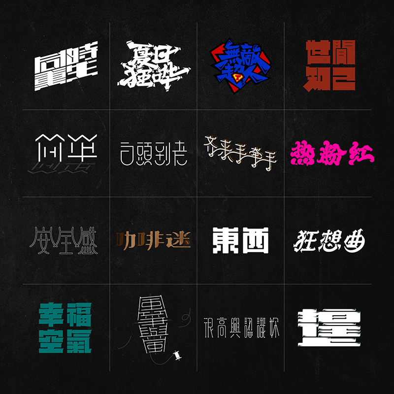
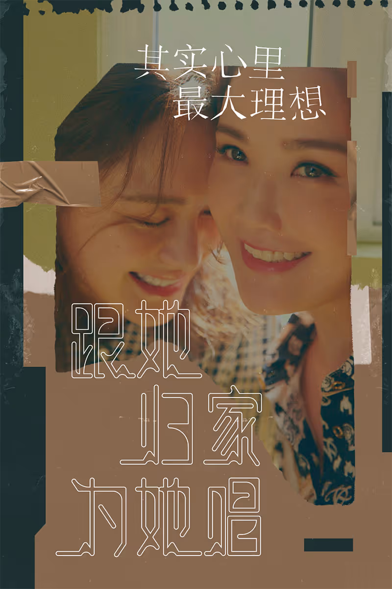
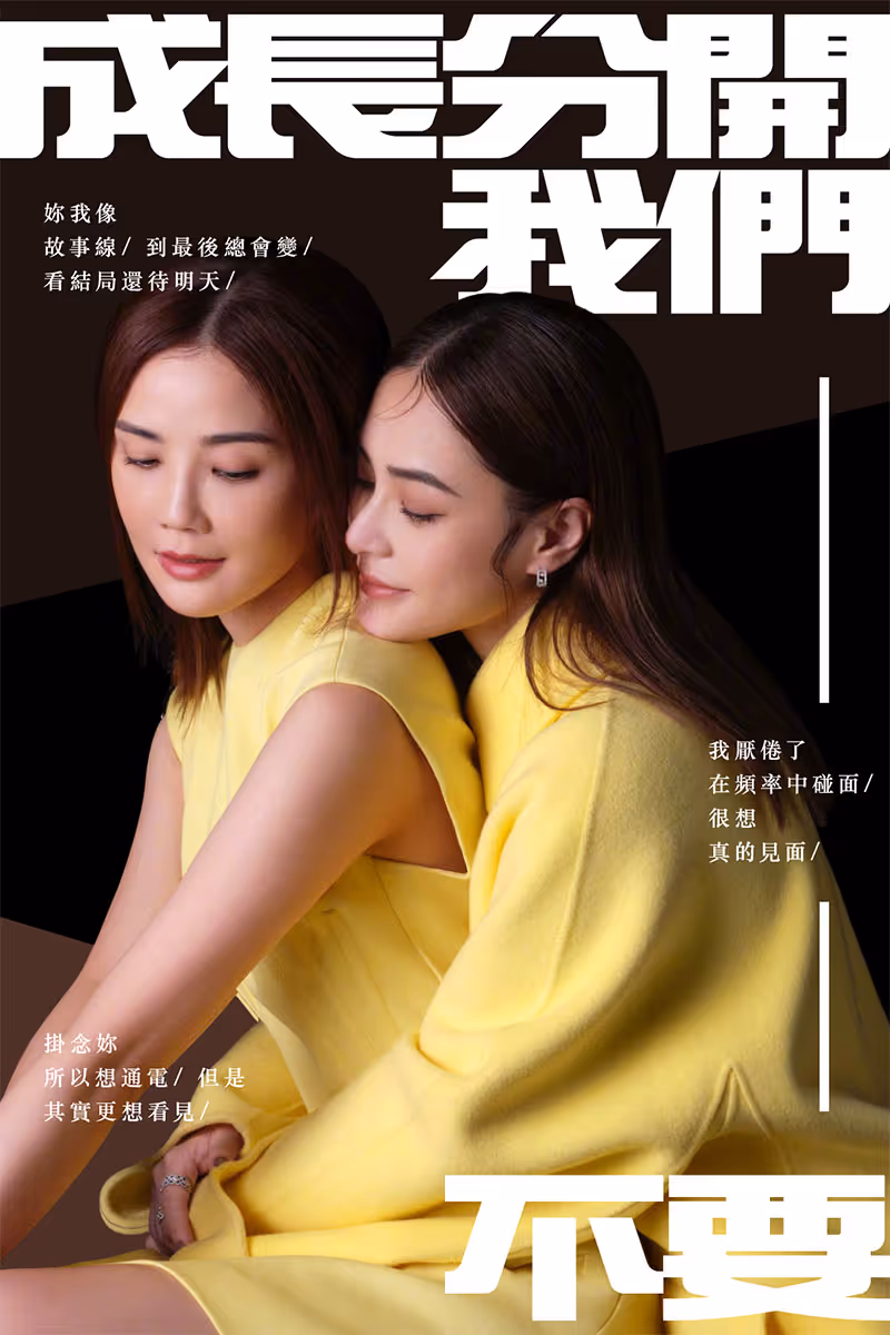
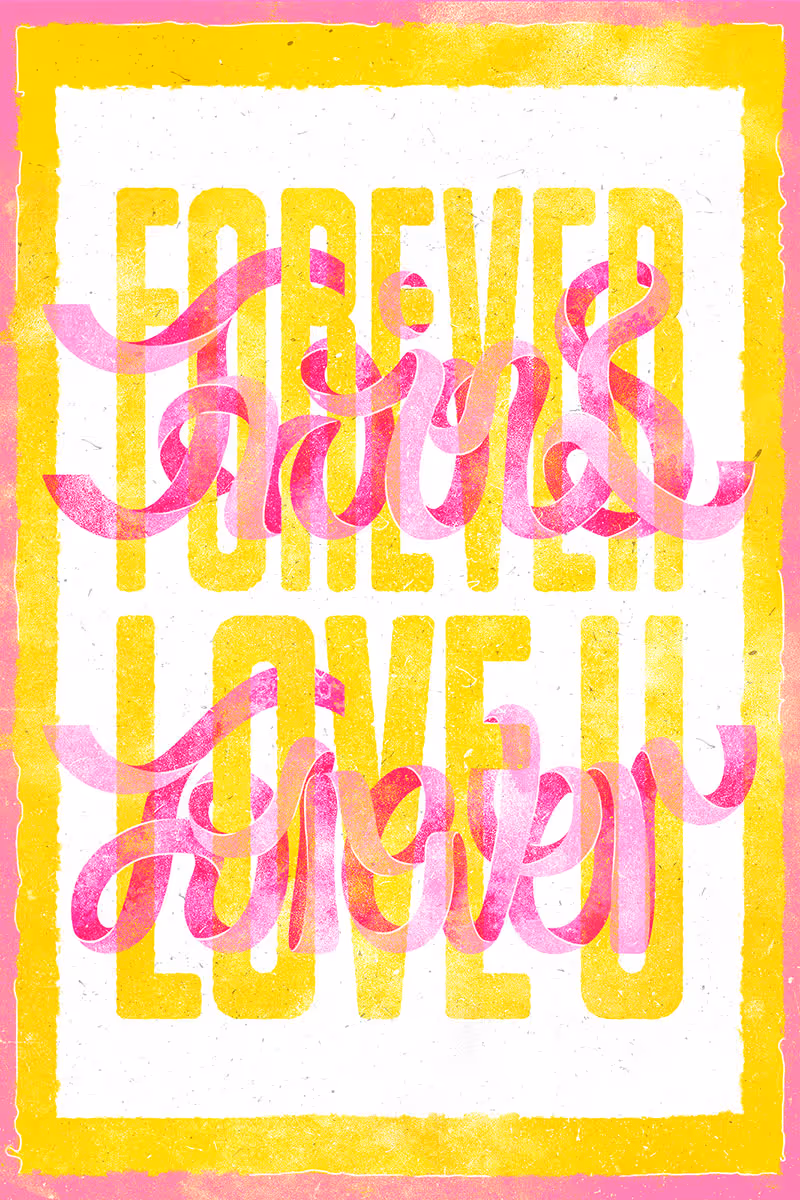
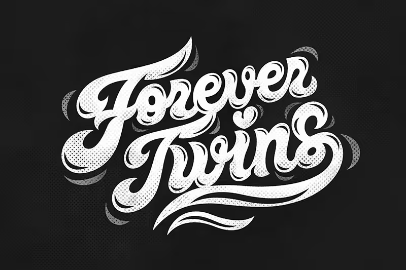
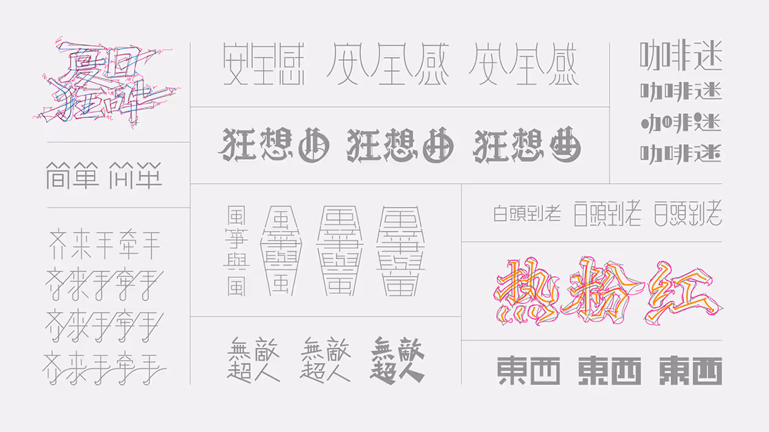
I developed display title forms in both Simplified and Traditional Chinese. The studies alternated between freehand sketches, typeface-based adaptations, and modular block/stroke constructions used to test rhythm and structure. Each concept was vectorized in Illustrator for precise control of stroke weight, spacing, and optical balance; I iterated on proportions and inter-character spacing so the forms read strongly at poster scale and in stacked headline layouts.
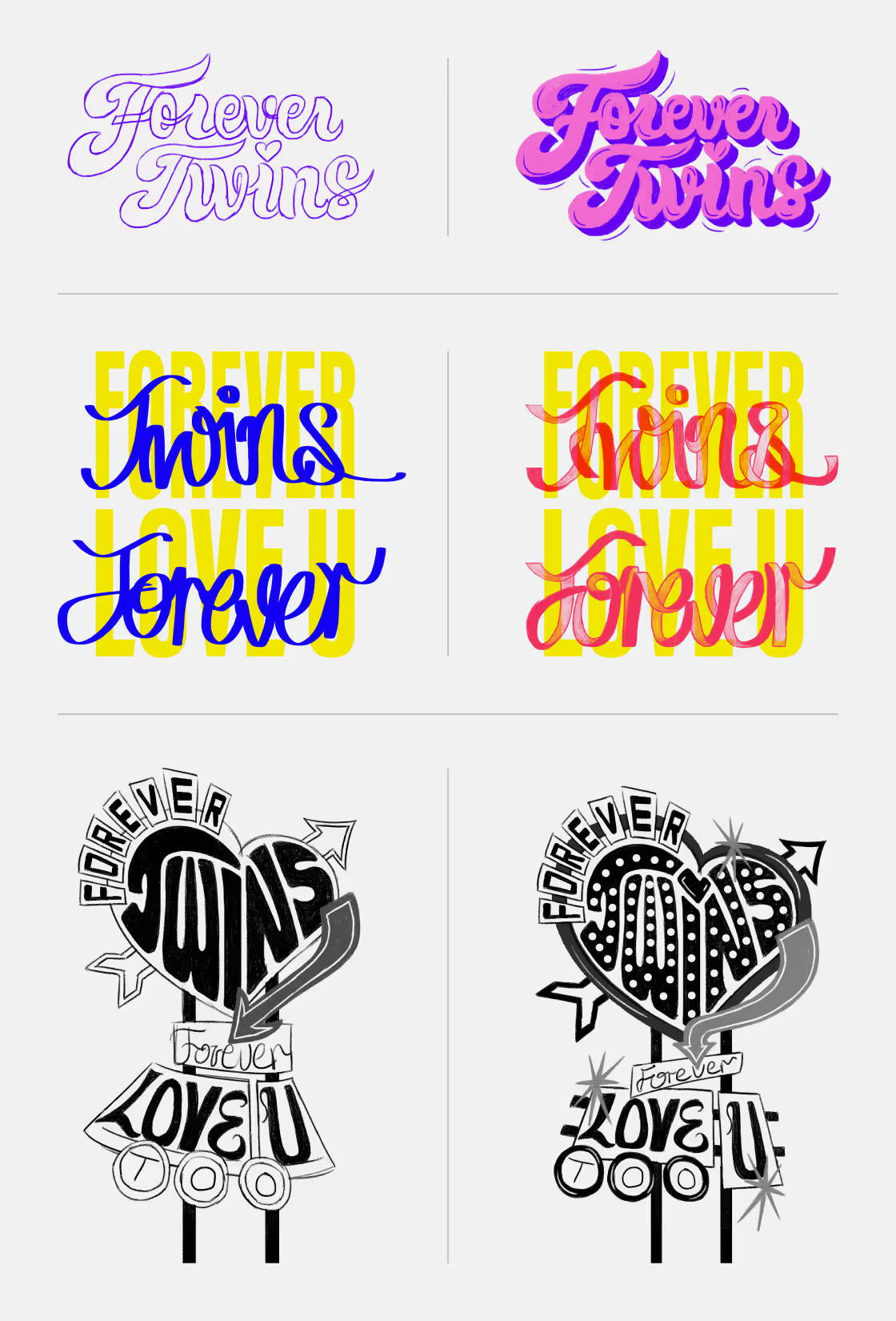
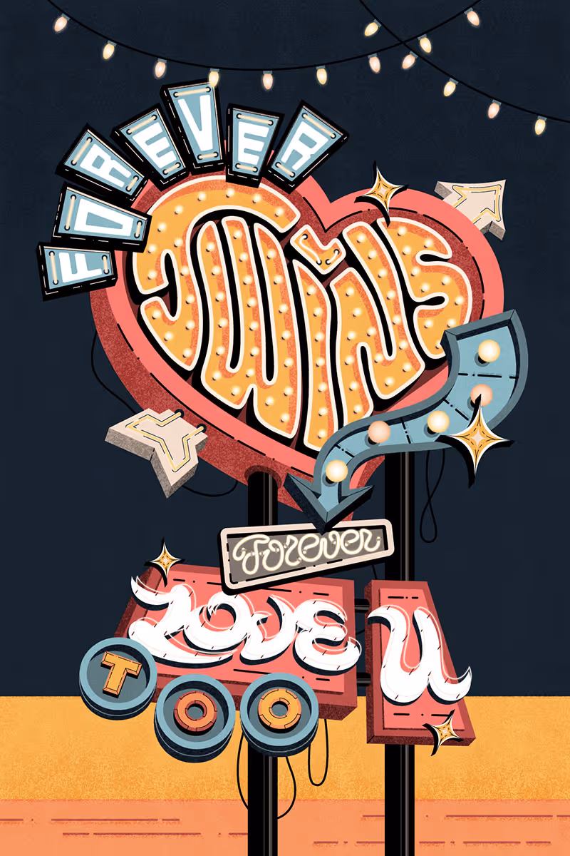
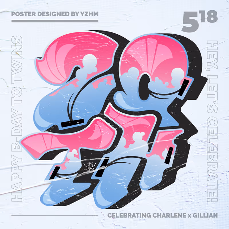
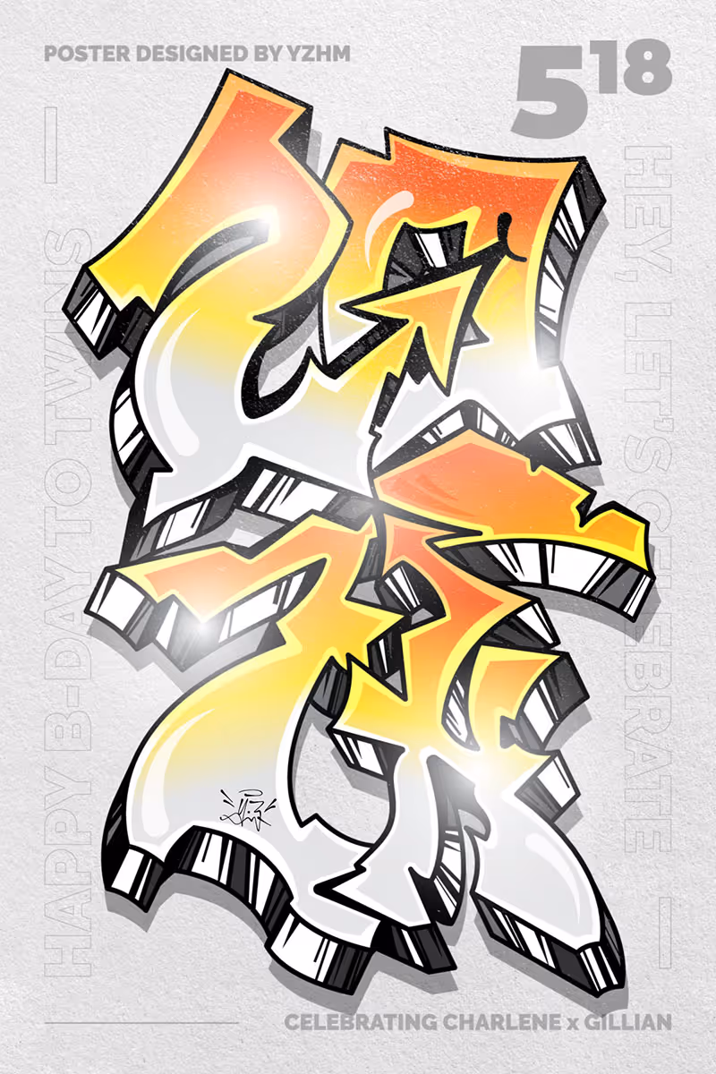
I began by sketching letterforms and compositions, then vectorized and refined them in Illustrator. I used the 'Extrude and Bevel' built-in effect to establish perspective on display pieces and applied texture passes in Photoshop to give the letters tactile surface and finish. The process preserved crisp vector outlines for scalability while introducing texture and depth for presentation and print mockups.