Yokō Matcha Bar is a brand identity project that blends the urban energy of Tokyo with the calm ritual of matcha.
Logo Design Concept
Yokō isn’t just a matcha bar — it’s a curated pause in Tokyo’s urban rush, where each drink is slow-prepared to capture that 'lingering fragrance' at the heart of its name. From the start, my brief was clear: the logo had to feel urban, grounded, and modern, yet still reference the timeless ritual of whisking matcha.
I began by building a bold, clean sans-serif: its solid, confident forms speak to stability and contemporary appeal. The real magic happened with the second 'ō', which I turned into a two-part icon: a matcha bowl whose gentle inward curves mirror the typeface’s terminals, and above it sits a gentle wave, like the ripple you see when you whisk. A fine inset counter helps the shape read as a letter at a glance, while still evoking the ritual motion of frothy matcha.
To reinforce this union of city and ceremony, I paired deep moss-green (matcha, tranquility) with charcoal black (urban grit) and a small red hanko seal bearing '余香' (the kanji for Yokō meaning 'lingering fragrance') for an authentic nod to Japanese heritage, like a traditional craftsman's signature. The result is more than a logo — it’s a visual promise of calm, a sophisticated invitation for urban dwellers to pause, sip, and savor the moment.
The
Challenge
One of the biggest challenges when designing the logo was figuring out how to make the 'ō' feel like more than just a letter. I really wanted it to echo the warmth and simplicity of a matcha bowl, without it feeling forced or overly literal. Getting the shape just right — round enough to feel soft and welcoming, but stable enough to hold its own as a logo mark — took a few iterations. I played around with curves, weight, and spacing to strike a balance between minimalism and meaning.
Another tricky part was keeping the whole wordmark harmonious. The custom 'y' and 'k' needed to feel unique, but not distracting. It was all about quiet details — subtle cuts and rounded edges that hinted at handcrafted care, just like the experience of sipping matcha.
The
Brand Story
In creating the brand identity for Yokō, my goal was to design a visual language that felt like an urban sanctuary — a quiet space where modern design meets traditional calm. The brand's philosophy is centered on the idea of a 'lingering fragrance' and the profound beauty of slowing down in a fast-paced city. Every design decision was made to reflect this deliberate contrast between urban energy and peaceful ritual.
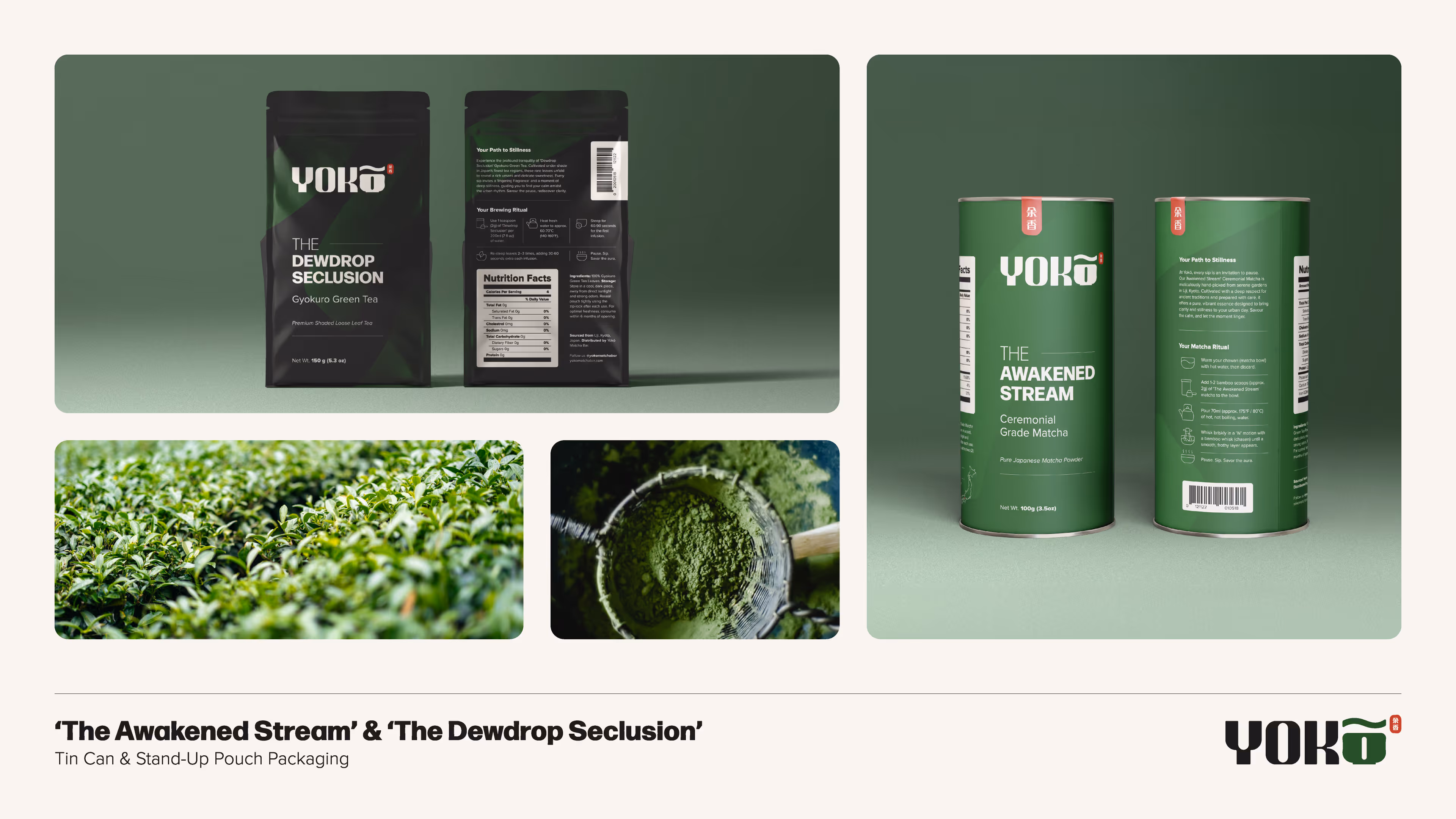
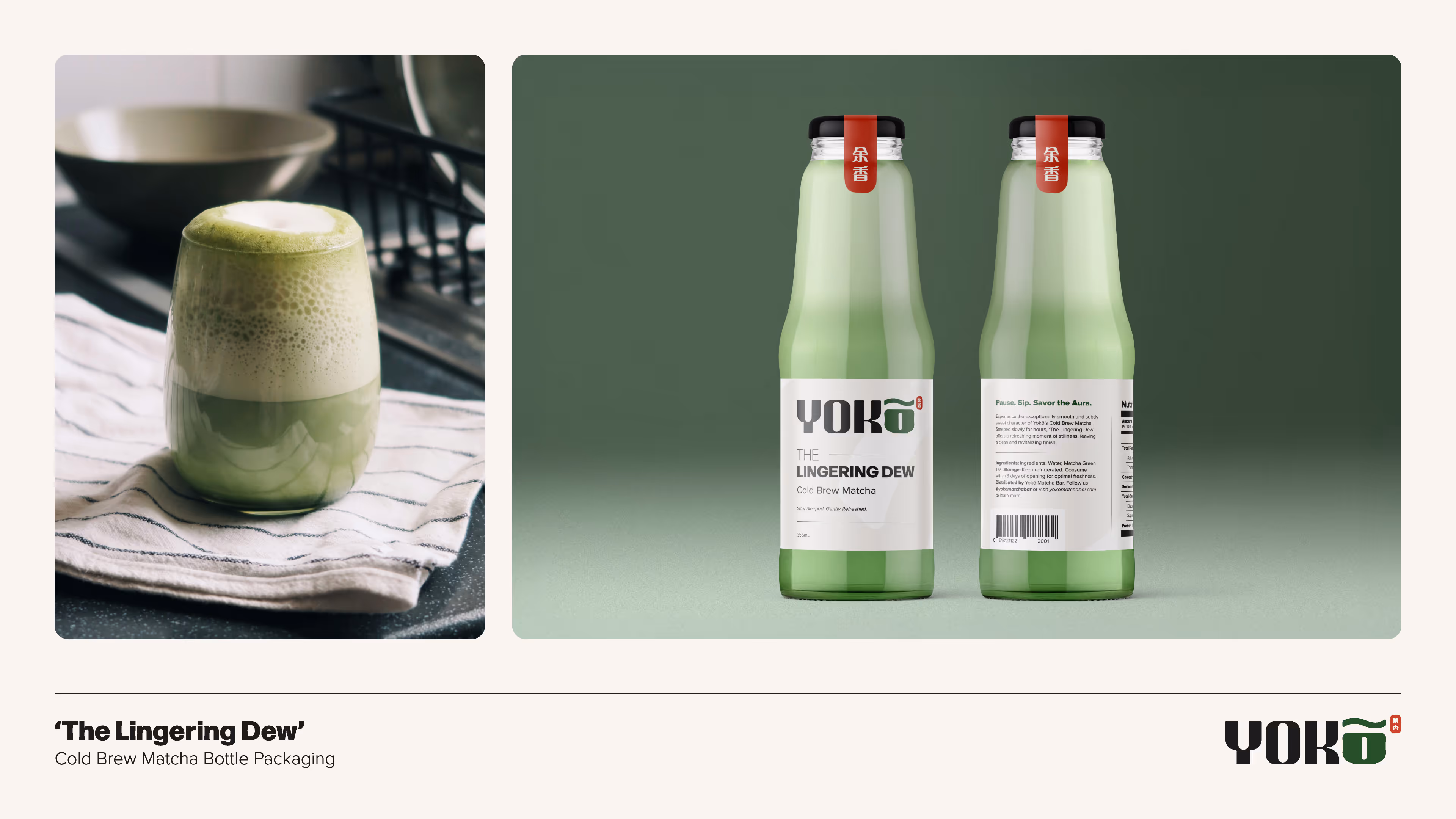
To establish this feeling, I began by choosing a deep moss-green as the primary color, as it is the natural hue of matcha itself, grounding the brand in its origins. I opted for a warm, inviting beige instead of a stark pure white, creating a softer, more approachable feel that complements the green beautifully. A key element of the logo, the gentle wave on the 'o', became a versatile visual motif. I used this wave in multiple ways: as a simple highlight, a clean divider for sections, and most notably, as a subtle background pattern. Rotated at 45 degrees and applied with a delicate foil effect, it adds a touch of modern luxury while hinting at the ripple of liquid and the flowing grace of the tea ritual.
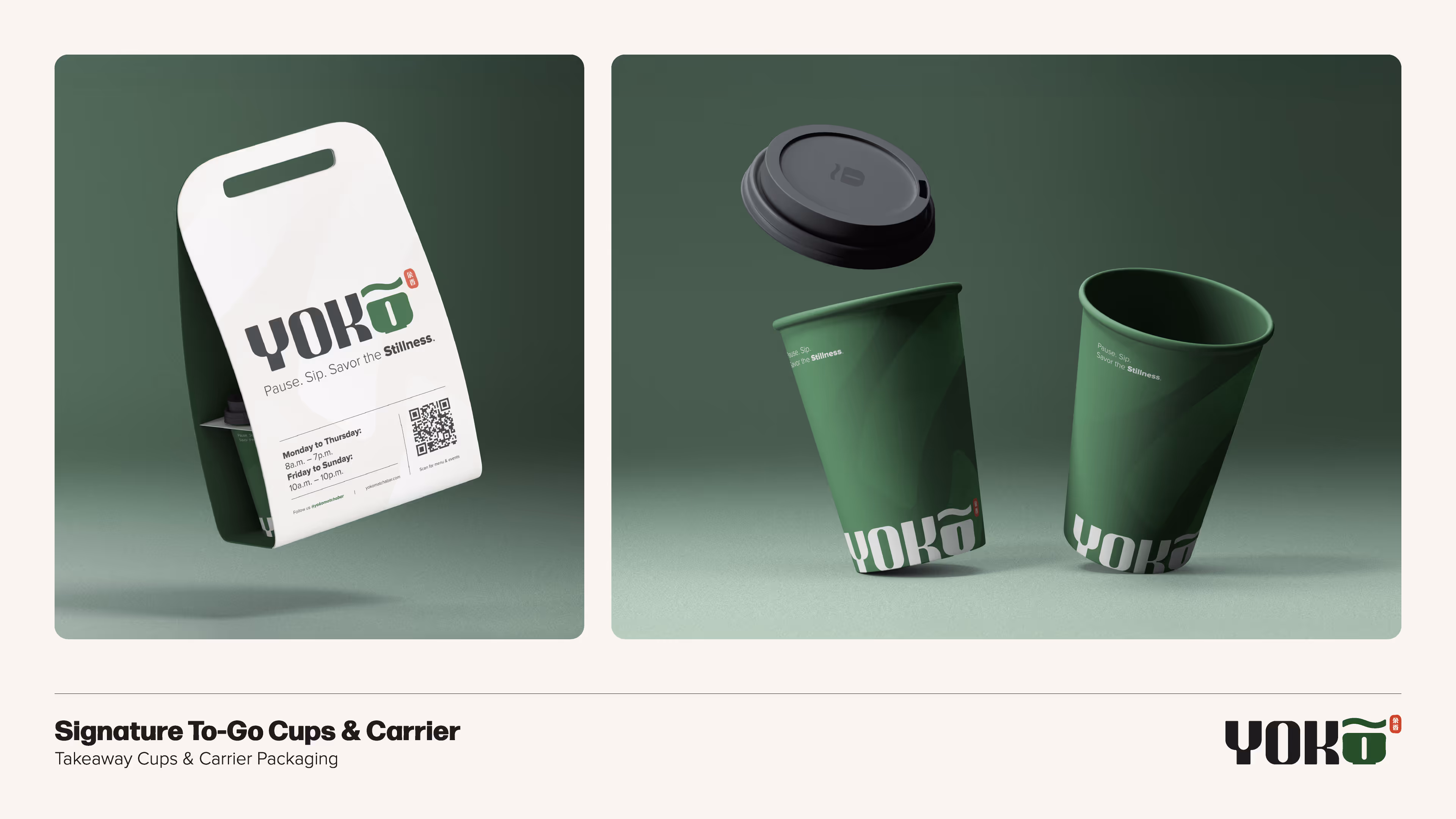
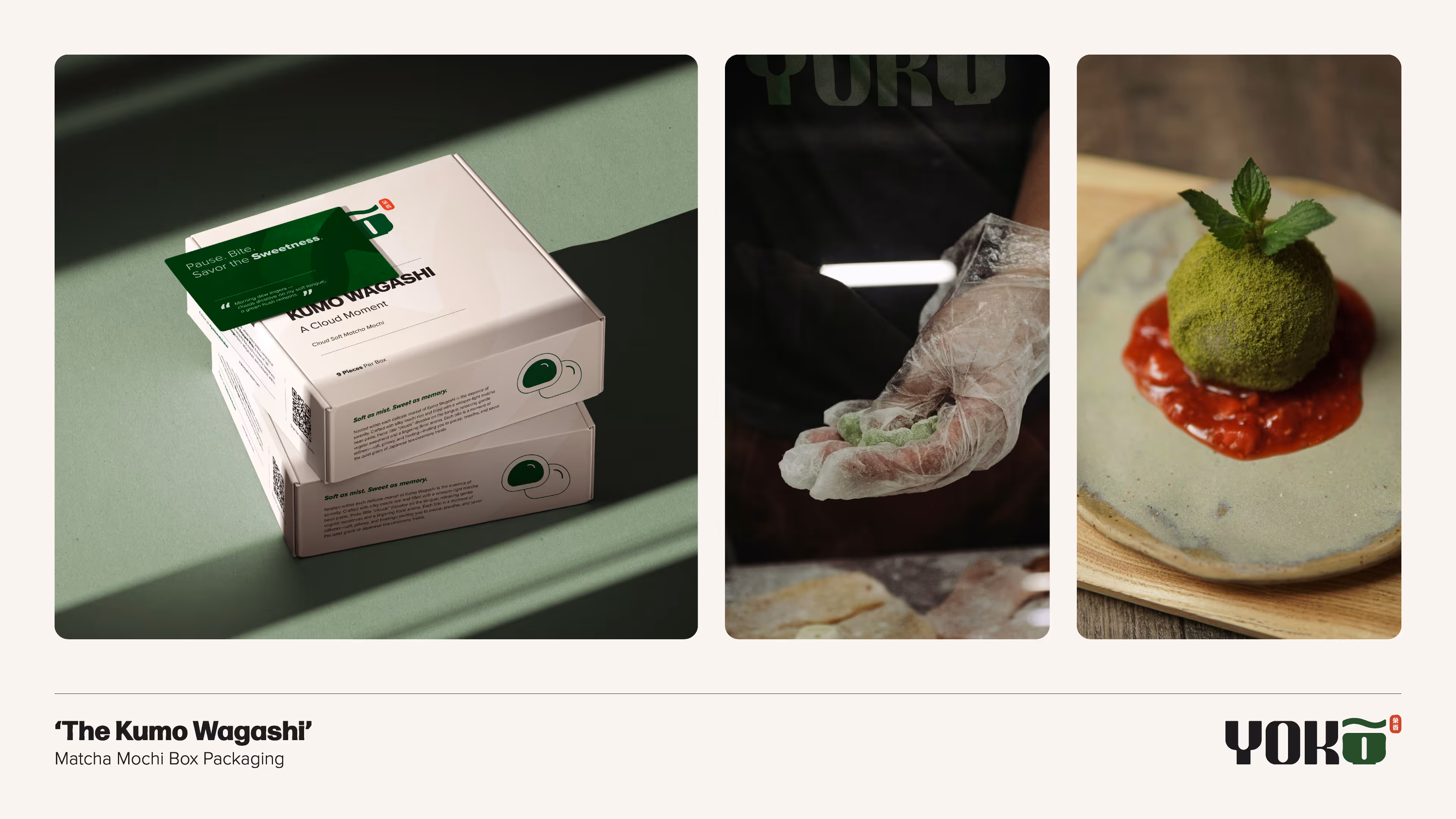
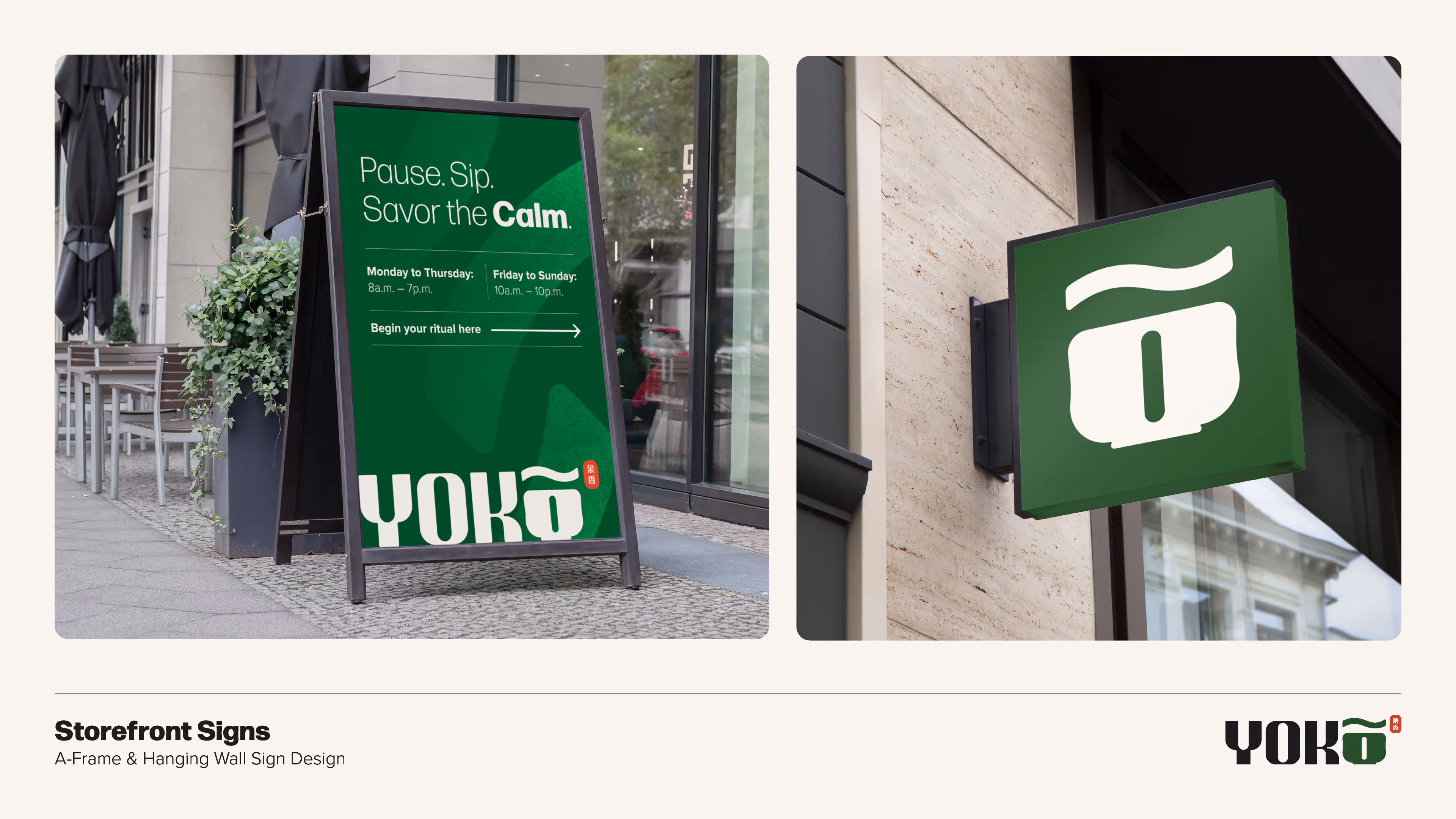
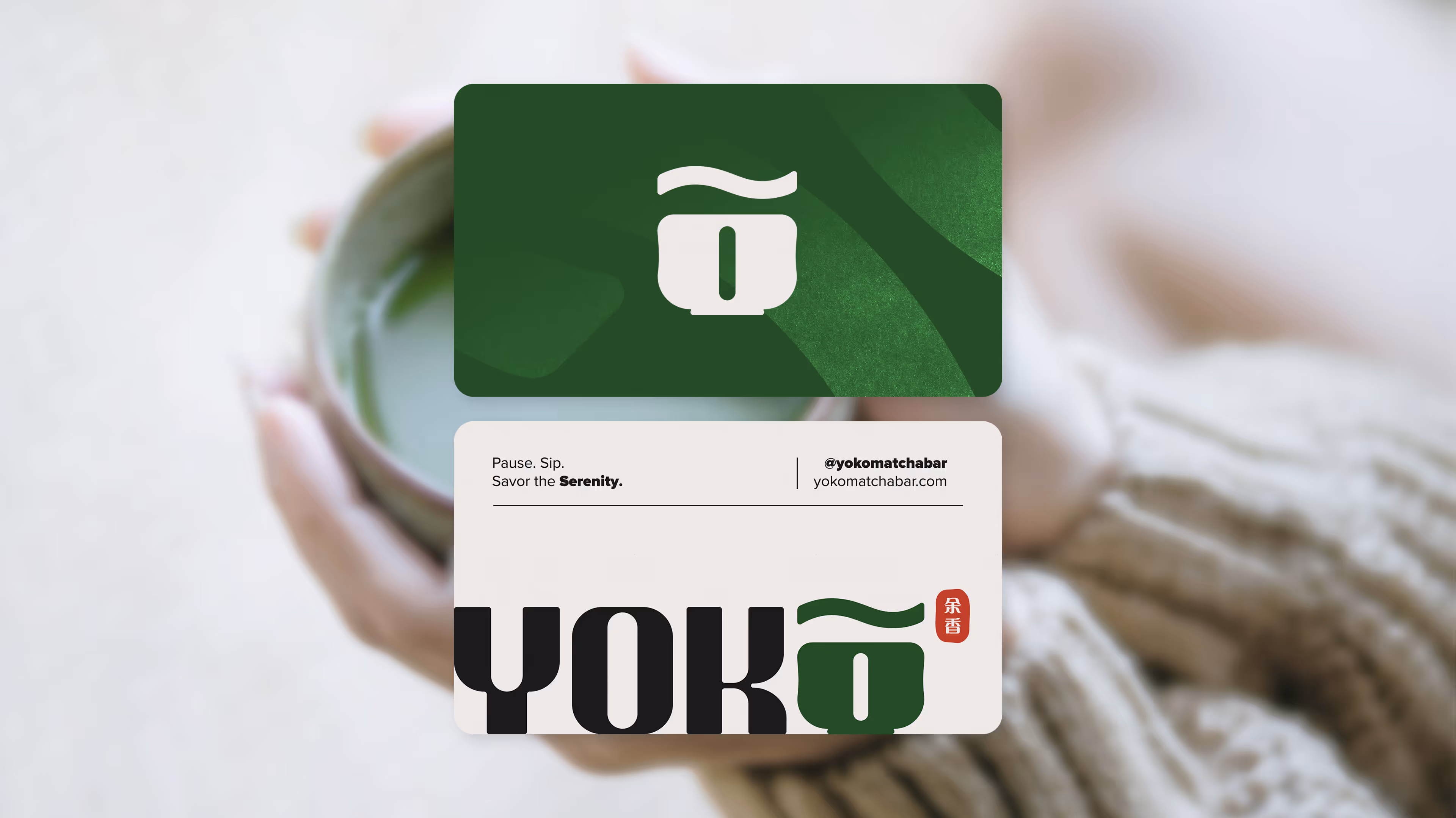
To mirror the smooth, flowing line of the logo, I ensured all packaging and design applications featured rounded corners. This simple detail creates a sense of softness and approachability. For typography, I paired a strong, contemporary primary font, Forma DJR Text, with a clean and simple secondary font, Proxima Nova. This combination feels both urban and grounded. I also used thin lines and rounded corners to create a set of simple, elegant icons. Just as important as what's on the page is what's not: I made sure to use ample white space across all designs. This negative space is a physical representation of the brand's core value — leaving room for breathing, for a pause, for a moment of stillness.
Finally, I developed a central tagline – 'Pause. Sip. Savor the __________.', different words like 'Calm', 'Stillness' and 'Lingering Fragrance' were used to fit different applications. This created a consistent but flexible brand voice. I used thin, elegant lines to divide content, and a clean grid system for layouts. This structural approach was directly inspired by the organized yet serene street alleys of Tokyo, providing a sense of order and discovery. Ultimately, every product name and every description was intentionally designed to reinforce these core brand keywords, ensuring a complete and immersive experience from the moment a customer sees the logo to the last sip of their matcha.
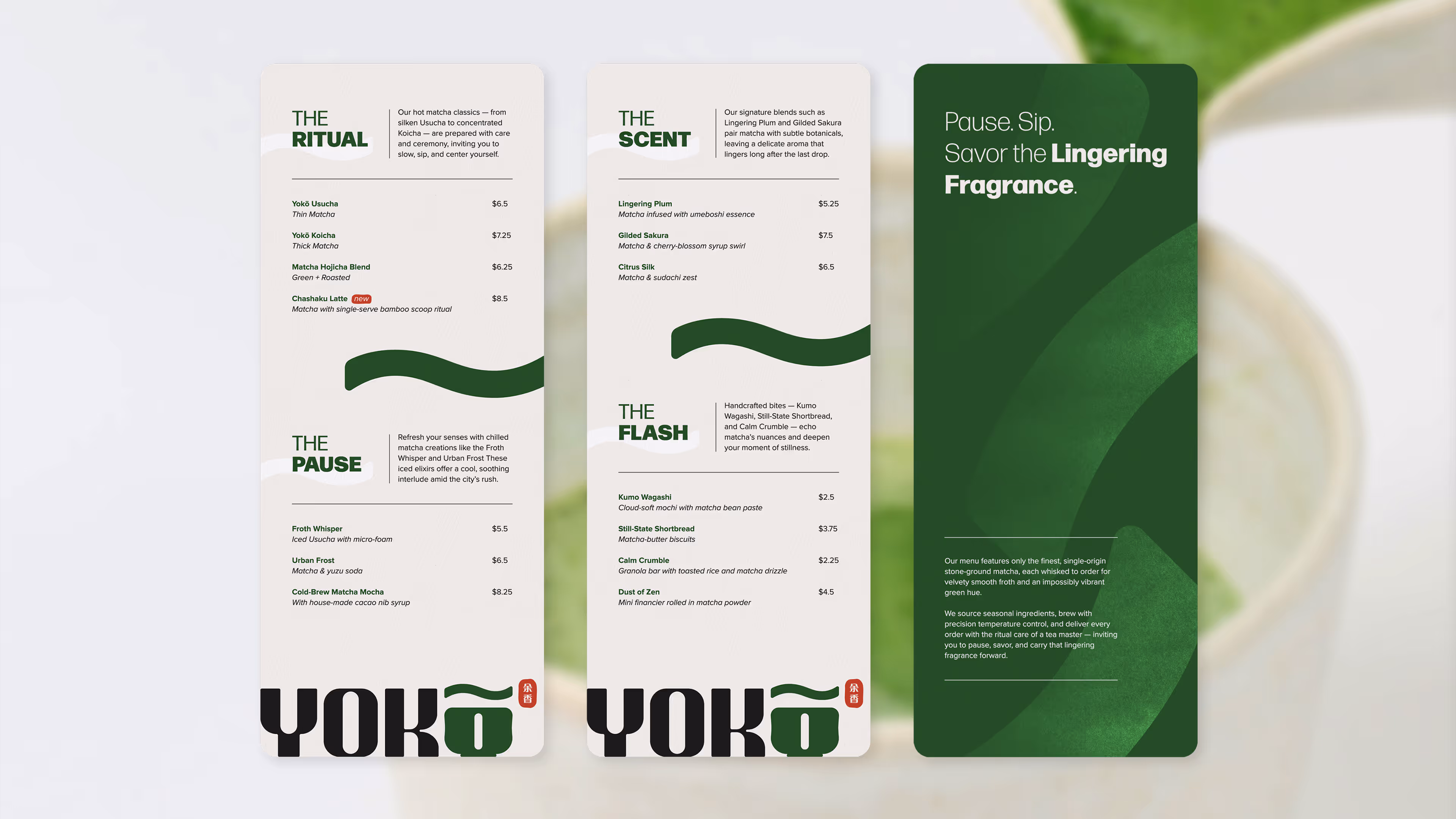
The menu was designed in 4.5"x11", the narrow and long format evokes a bookmark or a traditional Japanese scroll, encouraging focused attention rather than a quick scan.
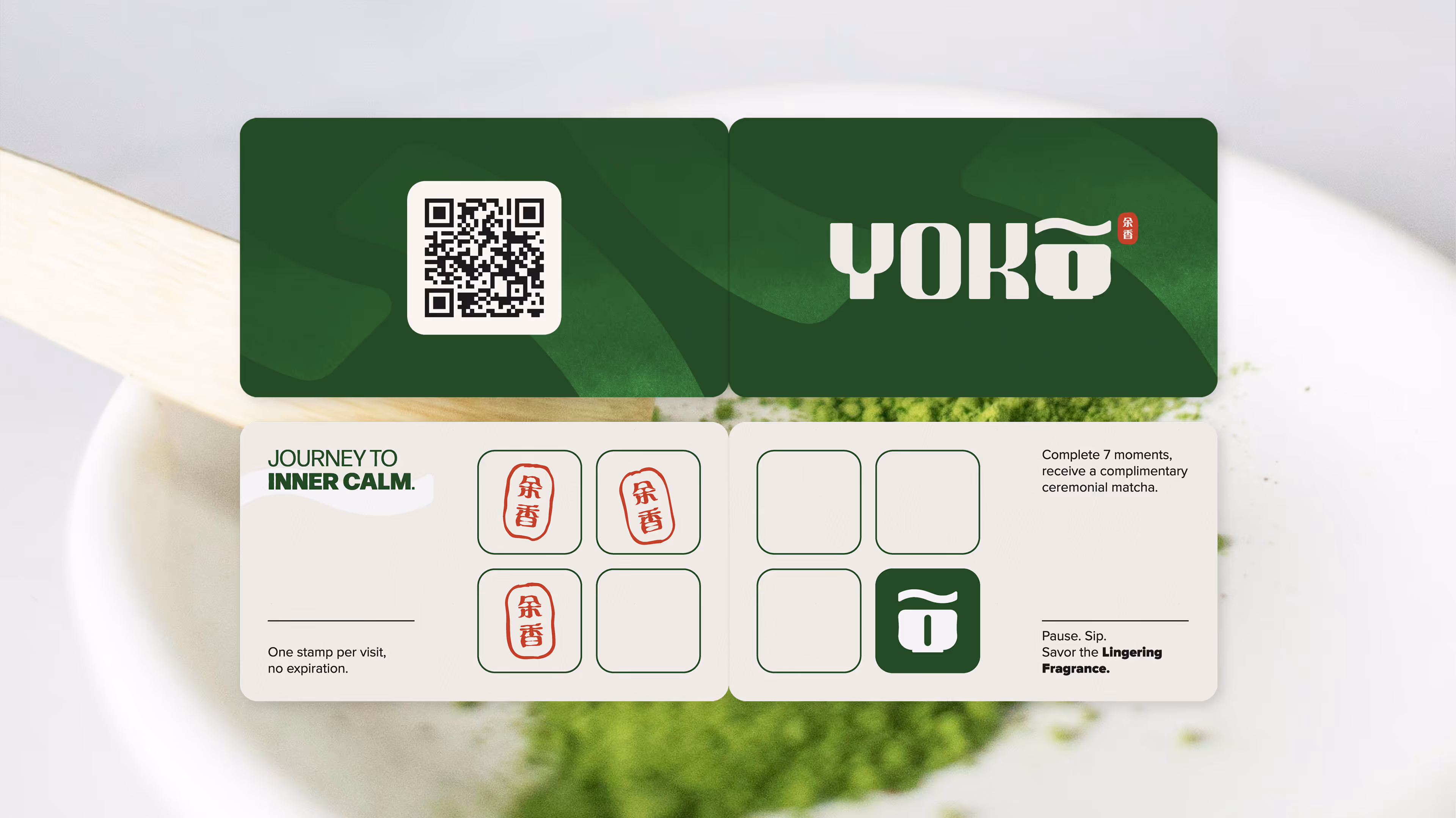
The 'Stillness Timestamp' loyalty card was designed as a bi-fold card, unfolding from a wallet-friendly business card size (3.5" x 2") to a neat 7" x 2". This format is practical for quick-moving city folks, but the act of opening it up subtly encourages a deliberate moment of engagement. On the inside I carefully integrated a subtle grid structure for the stamp spots, which once again was a deliberate nod to Tokyo's intricate yet orderly street alleyways. Each visit earns a distinct impression from the red seal, directly pulled from the Yokō logo. This makes each timestamp a tangible, branded moment of connection and progress.
Heavy and uncoated paper stock with a subtle texture were used to provide a grounded and luxurious tactile feel, inviting touch and connection.
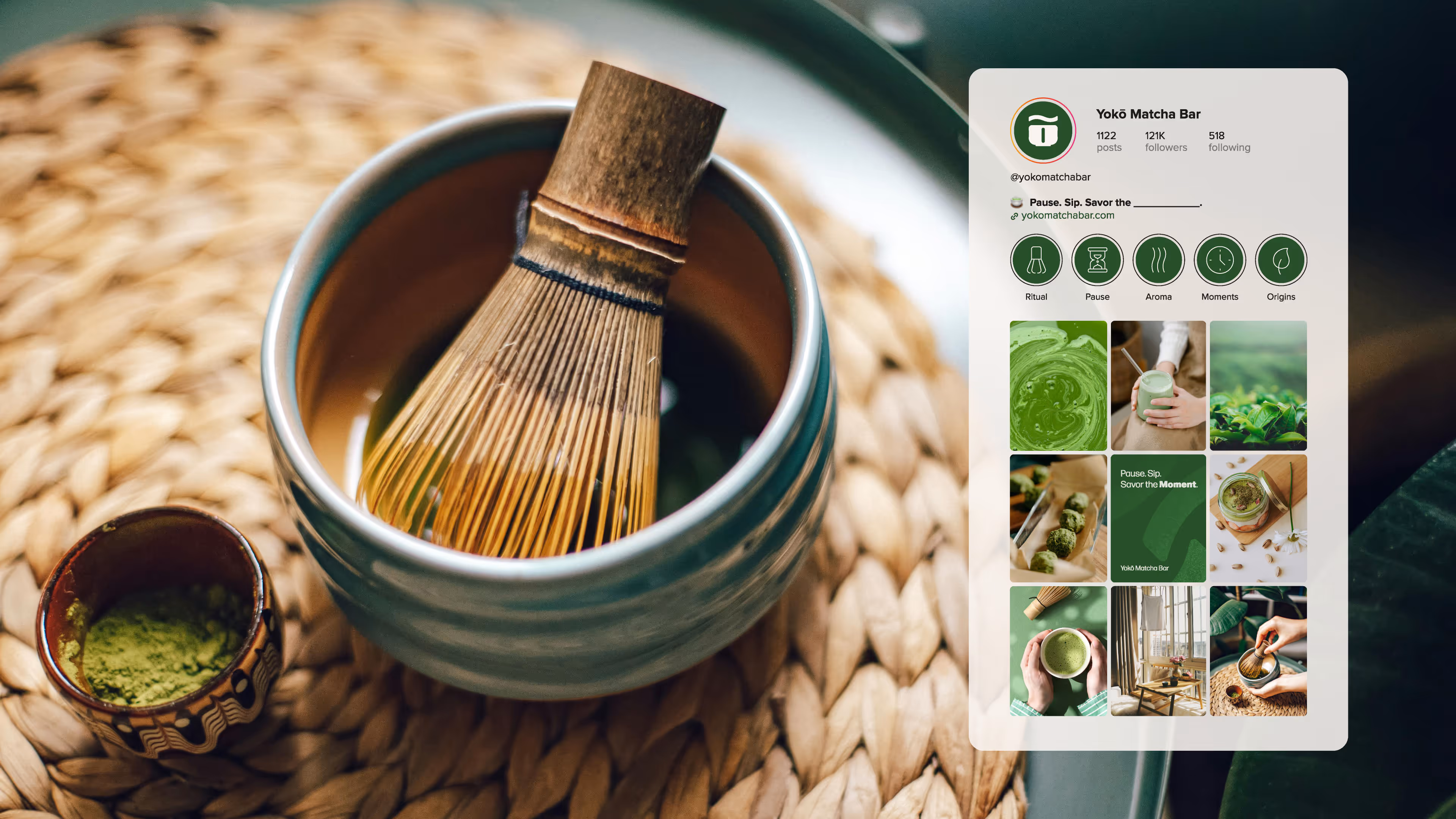
The goal was to create a feed that wasn't just a collection of posts, but a visual extension of the brand's philosophy. I wanted the feed to feel like a digital sanctuary, a quiet space in the noise of social media. Therefore, the visual strategy centered on a consistent green palette and still-life compositions that evoked matcha’s natural roots and invited viewers to 'savor the moment'. The feed mixed product shots with quick tutorials on baking and crafting matcha treats, showing customers how to weave Yokō into their daily rituals. It was designed to sell the idea of a brand that’s more than just a product — it's a lifestyle.